
What do the World Cup and Google Analytics have in common? They both love pushing vanity metrics.
Monthly Active Users
If you’ve read my User Engagement Blueprint, it would not be surprising to know that I consider MAU a vanity metric, something sexy at first glance, but overall it adds no insight.
At a certain point during our growth phase at LiveWell when we increased our registered users to around 700k within the space of months, our MAU hit crazy numbers.
If you’ve used Google Analytics, you’re probably familiar with a graph like this one below, it shows the Monthly, Daily and Weekly Active Users and you or others may be using this as a gauge of the effectiveness of your platform’s engagement with its users.
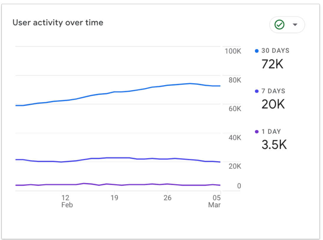
Google kind of obfuscates the meaning in its documentation, but without going too deep it essentially shows the unique number of users who have accessed your website or app in the last N days (30 days in the case of Monthly Active Users) at least once.
The World Cup
Remember this match you’re watching right now, it’s back, in graph form!

If you’ve watched this summer’s World Cup, you’d be familiar with the fancy new Match Momentum graphic which would, every-so-often during a match pop up to remind you of what you’ve just watched.
Match Momentum, like MAU provides a nice dopamine hit, it’s the confirmation bias wrapped in statistics, it confirms what you already experienced but this time it’s like you’re the guy from the Big Short staring at data all day.
Insights die a vein death
OK so what do either of these metrics, so prominently pushed upon us actually tell us? Well, not a whole lot.
Match momentum is certainly more advanced than MAU, and does a reasonable job of putting numbers on what we just saw, but that’s exactly the problem: it tells us what we just saw!
MAU on the other hand could be more insightful, we can see more and more users are visiting our website or app, but we already know we want engagement, not just visits. MAU tells us nothing about what those users did, whether the user was retained or came only once, whether they got value or felt violated.
So why is it pushed by so many platforms as the pinnacle of “engagement” metrics?
Well, number goes up, so let’s not think too hard.
Bringing value back
When we build a platform whose intention it is to engage with the users, we need to use data to understand whether users are actually getting value.
This means building a system of metrics and dashboards that look beyond MAU, that frames it from the perspective of the user’s experience and directs you to take actions that maximise the value delivered to the users of the platform.
My User Engagement Blueprint contains a KPI framework that you can implement right away if you’re already collecting analytics data, you will steer clear of vanity metrics and be able to pin-point exactly what actions to take to increase engagement on your platform and tell the real story of how your app is doing.
Get started now - get The User Engagement Blueprint for free