How to Spot Acquisition Masking Churn
Changing the way you present your MAU charts

In a previous blog post, I looked at MAU composition; that the headline MAU number actually contains the following distinct cohorts of users.
Today, I’ll go into visualising MAU in a few different ways that highlights the underlying cohorts and allows you to spot when acquisition is masking churn.
The 3 cohorts that make up the userbase
As a recap, I defined them as follows:
- Newly Enrolled Users - Users who enrolled in the current MAU period
- Retained Users - Users active in the current MAU period who were also active in the previous period.
- Re-Engaged Users - Users active who were not active in the previous MAU period but enrolled some time in the past.
It might be useful to look consider it in a table as follows, here we simply take “active” to mean visited the app or platform, which is the typical usage by analytics tools like GA4.
The Monthly in Monthly Active Users (MAU) typically means the previous 30 days from the report date (inclusive).
| Cohort Name | Current MAU period (0-30 days ago) | Previous MAU period (31-60 days ago) |
|---|---|---|
| Newly Enrolled Users | Active (Enrolled) | Not yet enrolled |
| Retained Users | Active | Active |
| Re-Engaged users | Active | Not active |
Reporting MAU The Regular Way
Representing data visually is an important aspect of the lean management principles from which the User Engagement Blueprint draws a lot of inspiration.
So if you’re charting MAU or using the standard dashboards that come with your analytics tool, such as GA4, you might end up with a chart similar to this.
Everything looks good at first glance the number is going up steadily with time - the platform looks healthy, but there’s an underlying problem,
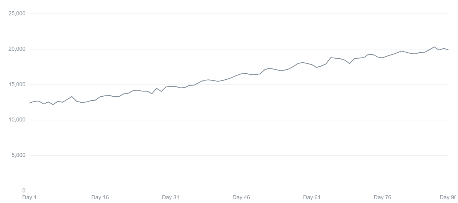
Line graph showing MAU growth from ~12k to ~20k users over a 90 day period
Applying Visual Management Principles
In lean management, when data is represented visually, it should be in a way that abnormalities, issues defects become immediately obvious, allowing the reader to understand what kind of corrective actions needs to be implemented.
If instead of showing the MAU line, we create a stacked area chart made up of the 3 cohorts, the combined total on each day still represents the same aggregate MAU number, but now we are getting to actually being able to understand what is happening.
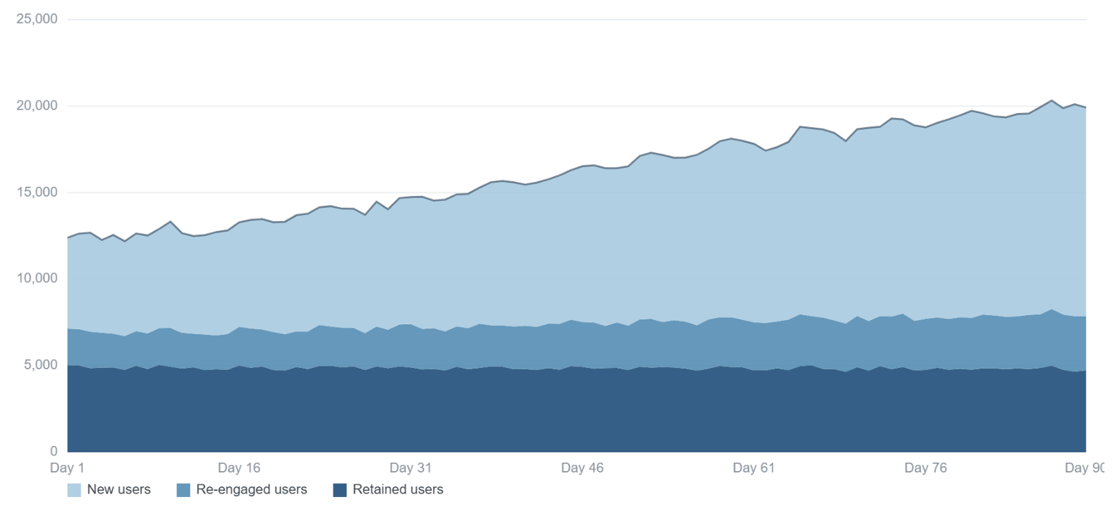
Stacked area chart showing MAU growth from ~12k to ~20k users over a 90 day period split by cohort
Understanding the scale of the problem
In the chart above we see that the key driver of the improving MAU figure is new user acquisition.
Hey, no big deal right, we need new users in order to grow our platform - so it makes sense that MAU is driven by acquisitions.
Not exactly, because these new users are not sticking around.
We can make it more explicit: Here’s the same data again in a 100% stacked are chart, now we can see the change in proportions over time.
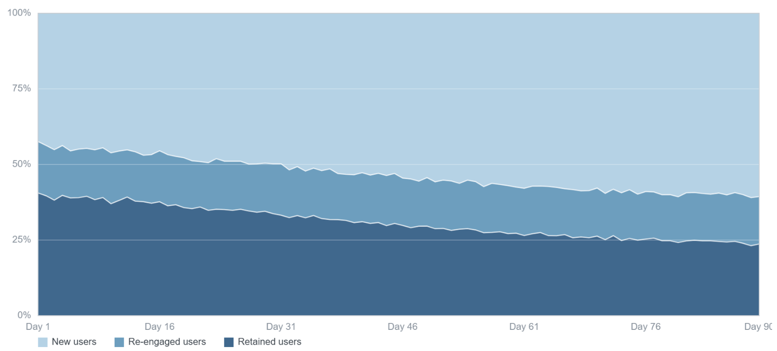
100% stacked area chart showing change in proportion of the 3 cohorts making up MAU, over a 90 day period
This is where we’re starting to see the real issue: acquisition is masking churn
In the 100% stacked area chart, we see that the proportion of retained users is actually decreasing, while the proportion of new users is increasing over time.
This means that the new users that are joining the platform are not converting to retained users (i.e. not sticking around longer than 30 days) at the same rate as they were at the start of the 90 day period.
Not looking at MAU as 3 separate cohorts is costing you money
What we have here is acquisition that is growing the top of the funnel (the increasing new user cohort), without growing the base of retained users beneath it.
Over time, as new users convert to being retained users at a lower rate, holding the retained user base steady requires progressively more new users.
The cost of maintaining the retained user base steady (which typically are the monetisable ones), rises. Even where cost per acquisition is flat. At some point you have to control the spending.
Focusing on retaining users by building a better product
This is also why the problem stays invisible for so long, as I have shown, the compensating acquisition works, headline MAU keeps rising and this is typically what’s being reported. Nothing in the aggregate view signals that the ratio underneath it has moved.
But the change in approach is relatively straight forward, focusing the development efforts on building features that your users love, so that they feel like they are getting value and keep coming back.
If you want to understand where to focus your development efforts in order to grow your monthly retained users, my User Engagement Blueprint provides exactly a structured approach to analysing and understanding user metrics.
Get started now - get The User Engagement Blueprint for free